
From Print to Digital Writing
You may carefully craft each word. Yet, writing for the web follows different rules than print. People don't read online. They scan.
Thankfully, we have user experience (UX) design experts like the Nielsen Norman Group (NNG), who have been studying writing for the web for decades.
As a Learning Experience Designer, I've learned UX design from the NNG and UX courses from Interaction Design Foundation and Google. Use these 5 UX principles to make your digital content clear and impactful.


1. Know Your Readers
Check Your Assumptions
To think like a UX designer means you know you are not your user! The way you read every word of your website, blog, or email is not how others will read it.

Be Curious and Learn About Your Readers
The most important step is to know your readers. Use surveys, focus groups, empathy maps and/or personas to better understand your readers. Review real data. Release your assumptions. Write for the needs of your readers.
Key Questions:
Your audience: Who are you writing for? Understanding your readers will help you identify readers' needs, the style of writing that works best, and the technical terms that may or may not be known.
Purpose for reading: What do they want? Are your readers looking for a specific fact or a deeper understanding? Why would someone want to read this?
Purpose for writing: What do you want as the writer? What are your goals as the writer? For example, is it to establish your expertise, offer a service, or expand your network?
Quiz
You’re creating an online course on time management for busy professionals. Which headline best reflects the WIIFM principle?
2. Create a Visual Hierarchy with Headings
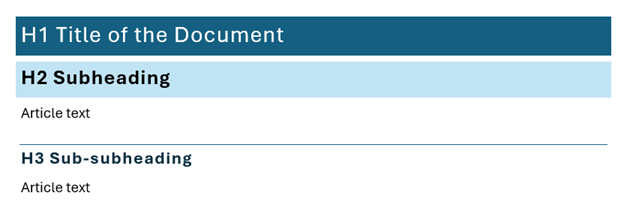
Your headings can mean the difference between users reading your material or moving on. Headings are also key for accessibility (more on this coming up). Using an editor toolbar, assign a heading level to each of your headings, e.g., H1, H2, H3. There should be only one H1. H2s are your subheadings, and H3s are your sub-subheadings.
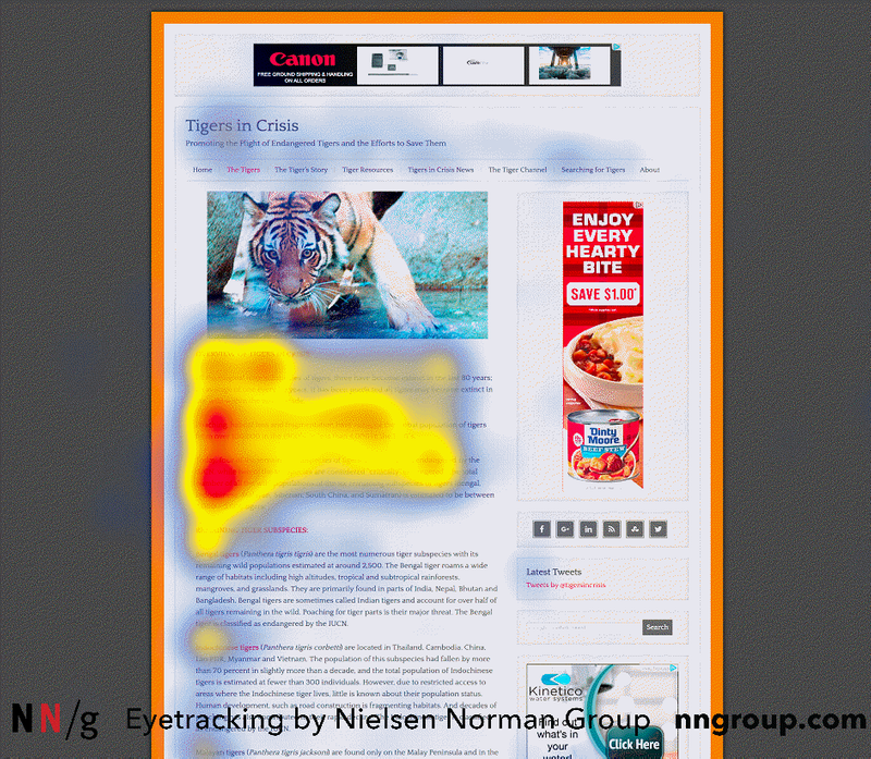
Gaze Patterns
The F-pattern is one of the most well-known gaze patterns from UX studies. Gaze pattern studies track where users look at a particular webpage and for how long.
The F-pattern is where users read the first lines and the first few words:
Dark red = longest eye gaze
Yellow = moderate eye gaze
Blue: minimal eye gaze
No colour = skipped the content
 Nielsen Norman Group. Pernice, K. (2017, November 12). F-Shaped Pattern of Reading on the Web Content. Retrieved October 23, 2025.
3. Make Your Content Accessible
Accessibility makes a huge impact on user experience. When the web is designed to work for all people, whatever their hardware, software, language, location, or ability, it is accessible. This includes people with a diverse range of hearing, movement, sight, and cognitive ability.
Web Content Accessibility Guidelines 2.2 is the go-to source for meeting international accessibility criteria.
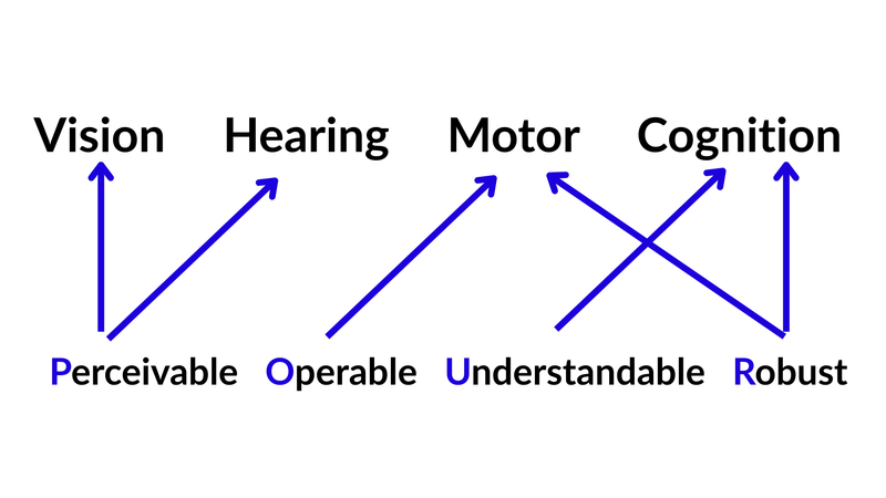
Accessibility Guidelines Success Criteria
The WCAG success criteria are organized into four sections: perceivable, operable, understandable, and robust (POUR). This diagram shows how each section connects to ways users interact with content through vision, hearing, motor movements, and cognition. Perceivable focuses on vision and hearing criteria. Operable and robust focus on motor criteria. Understandable and robust focus on cognition criteria.
 This image was redesigned in Canva based on a diagram by the Karten Network.
Examples of Accessibility Practices for POUR
Perceivable: include alt tags for images, descriptive links instead of "click here," proper colour contrast (try a contrast checker), and captions for video.
Operable: ensure interactions can be accessed using a keyboard (tab and enter). Avoid time limits.
Understandable: use plain language and consistent navigation. Give clear instructions on forms.
Robust: use built-in heading styles in your editor, such as H2 for subheadings.
 Learn More
Optional reading: see the full WCAG 2.2 Guidelines. For simplified guidelines, see the WCAG 2 Checklist(WebAIM) and Writing for the Web (W3C Web Accessibility Initiative).
Quiz
You're adding a hyperlink to an accessibility resource on your site. Which text would make the most accessible link?
4. Say It Simply
Use Plain Language
Clear, concise writing is more likely to meet the needs of your readers than dense, technical writing. Don't write to impress with fancy words. Write with purpose. Often, aim for a reading level of grade eight (approximately age 12-13).
Edit for Lean Content
Edit in multiple rounds to create lean content. As you edit, you refine your thinking on the topic. This benefits you and your readers. Think of editing like spring cleaning. Take out filler words. Keep what matters most. Review it until it shines!

 Brief is Brilliant
Watch this 2-minute video by Jakob Nielsen, Principal of the Nielsen Norman Group. He shares that the shorter the word count, the more the user is likely to understand. Nielsen recommends that when writing for the web, cut word count by 50% compared to print.
Quiz
You're writing a blog post and want to make sure it is written in plain language. Which of the following strategies support writing in plain language? Check all that apply:
5. Chunk Your Content
To chunk content, we want to bring groups of related information close together in our content designs. This improves memory and retention. Our short-term memory is limited. We want to group connected information together to remember it more easily.
Formatting Techniques
We can do this by using the following formatting techniques:
Headings and subheadings
Paragraphs and whitespace
Highlighted keywords (bold, italics)
Bullets and lists
Tables
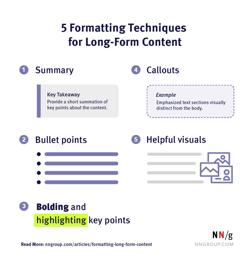
Example of Chunked Content: Infographic
Above, you were provided formatting techniques in bullet form. Check out 5 Formatting Techniques for Long-Form Content for a great infographic.
 Nielson Norman Group. Wang, H. and Chan, M. (2023, November 17). 5 Formatting Techniques for Long-Form Content.Retrieved October 23, 2025.
 Put It Into Practice
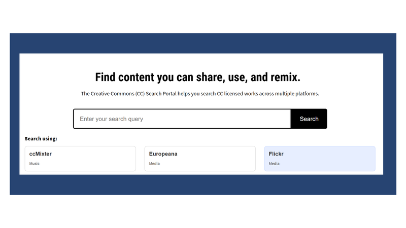
Review the website below: Creative Commons Search Portal. Visit the page. Note the use of headings, whitespace, and chunking material. The heading clearly states what this website is all about: "Find content you can share, use, and remix."
The subheading provides further context: "The Creative Commons (CC) Search Portal helps you search CC licensed works across multiple platforms." The actions are intuitive with the centered search bar. It also prompts you to select a platform. I chose Flickr.
Try reviewing some of your favorite websites for formatting techniques.
Quiz
You’re redesigning a long FAQ page for a government benefits website. The current page has 20 questions in one continuous block of text. Which approaches best apply chunking principles?
Take Action
Reflection: What actions will you take to apply UX principles to your writing?
Apply UX principles to transform your digital writing:
Your feedback matters to us.
This Byte helped me better understand the topic.